Statistics 7 · Year 8
Vertical Line Charts and Frequency Diagrams
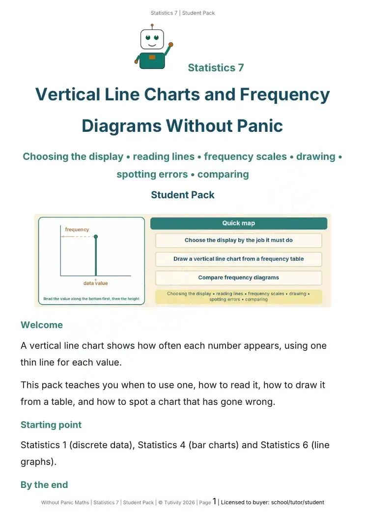
A vertical line chart shows how often each number appears, using one thin line for each value.
£3.50
Without Panic Maths · Statistics 14
Paired data • plotting points • drawing a scatter graph • positive, negative and no correlation • strength and outliers • careful conclusions
What this pack does
A scatter graph shows two measurements for each person or thing, as one dot. This pack teaches you to plot paired data, draw a scatter graph from a table, describe the pattern as positive, negative or no correlation, judge how strong it is, and write a careful conclusion.
Inside every pack
Pupils tick how a topic feels before they start, and again at the end. There are no marks, so it's an honest picture of where they are.
Each topic is split into small steps. Every mini-lesson opens with one big idea and a short, plain-English explanation.
Diagrams such as a formula 'rule machine' or a place-value picture show the maths, so pupils can see it as well as read it.
Every method is modelled step by step before pupils try it, with each stage labelled so they can follow it on their own.
Questions start with prompts (what do you need to find, follow the example, check it makes sense) and gradually ask for more independence.
Common mistakes are named before pupils make them, and Mistake Detective questions ask them to find and fix errors.
Short 'explain it in your own words' prompts check that pupils understand why the maths works, not just how.
Every pack comes with a Teacher Pack: all the answers, plus reteach cards saying what to watch for, what to say, and what to try if a pupil is still stuck.
More statistics packs
A vertical line chart shows how often each number appears, using one thin line for each value.
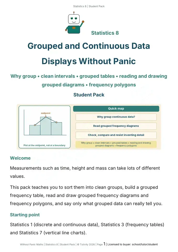
Measurements such as time, height and mass can take lots of different values.
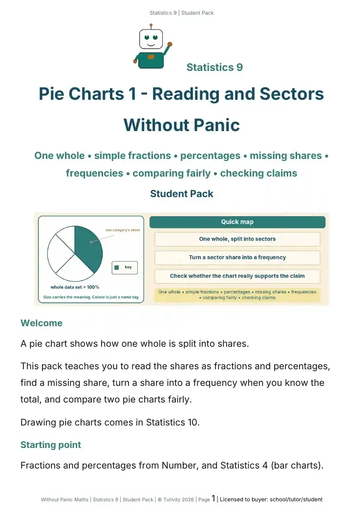
A pie chart shows how one whole is split into shares.